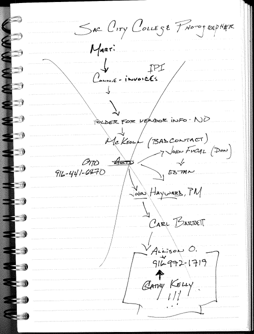
One of the joyous duties of my new job seems to be endlessly hunting for extraneous and not-so-extraneous information for the marketing department due to either incomplete recordkeeping and a disconnect from the prior person in my position. A seemingly simple task of finding the name of a photographer who shot a building IPD designed in 2000 led to me tracking a number of steps to get the answer. I have taking to keeping flowcharts/brainmaps to see how I got to the final answer. I have also taken to using a nifty new software with a free basic version I found at MacWorld called PersonalBrain (http://www.thebrain.com/) to see if I can retrain my brain to handle multi-tasking more efficiently (a real challenge at age 38). Here is the workflow to find the photographer, Cathy Kelly…

How to locate a photographer, 9 years removed...

How to locate a photographer, 9 years removed...

Scene from the Rainforest exhibit at the new CA Academy of Science, San Francisco

Scene from the Rainforest exhibit at the new CA Academy of Science, San Francisco

The luckiest picture I have ever taken, courtesy of the new California Academy of Science in San Francisco. More thoughts on the design and signage to come…

Thanks to Jen McQueeney for a yearbook signoff that still resonates today…


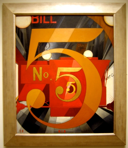
This is art

This is art


One of my top 10 paintings and now I’ve seen it up close. Awesome…


Once again, Johanna and I happily went to the newly renovated Alameda Theater to see, chills to my spine, the Dark Knight. We had made a pact to only walk to theatre from our house but I wanted to be at the theatre in plenty of time due to the popularity of said movie. Happily, we were able to get tickets and have time for a quickie Mexican fare dinner at Viva Mexico.
First off, the movie is long and challenging to watch for a summer blockbuster. Given that, I think it was brilliant for that genre and it beckons me to see it again, which is saying quite a bit for me nowadays…
I did just want to comment on the costume design of Batman. It’s obvious that the director wanted to put this franchise into as real of a world as a superhero movie can live in and the Batman costume has been tweeked accordingly. It is especially noticable with the mask as the new one looks more utilitarian (especially the neck area). While it makes sense to have a bat costume that is functional as well as cool to look at, I miss the stylized look of the first costume, the lines of it are just cooler…
Okay, back to work!


One of my favorite things to do on Friday nights, now that I don’t have a company that supports happy hour endeavors, is to go to the movies, which usually means driving off the island and having to deal with those mainland-types in Oakland or San Francisco. Well, much to my joy, the renovation of the Alameda Theatre, http://alamedatheatres.com/, is complete and a spankin’ new 7 screen cineplex is now walking distance from our house! Johanna and I made our first visit Friday night to see another golden-oldie brought to life with Indiana Jones and the Kingdom of the Crystal Skull . Here are some thoughts on both the theatre and movie:
The Alameda Theatre
The theatre maintains it’s 1932 art deco exterior (much to my happiness) with it’s iconic signage and use of oldstyle marquee lettering to announce the movies playing. I guess I’ve gotten so used to looking at marquees like the Metreon that it took me aback for a moment but I like it. Tickets are, at the moment $9.50 for an adult with a $7 matinee. Kids and seniors get in for $7 anytime.
The lobby is dark but amazing, with a tall ceiling and gold trim. It outshines the Grand Lake Theatre lobby for art deco lavishness but the organization of getting tickets, giving said tickets to the usher and finding your theatre left a lot to be desired. The interior signeage defintely needs some re-thinking. From what I surmise, the mainscreen (which was showing Sex & the City for it’s opening night) is the original theatre’s big screen and easily found by going up stairs from the lobby. What was not so easy to figure out is that there is another side escalator that leads to the other 6 screens and are located in a structure built on to the old building. The decor of the new area has a modern feel but lacks the character of the original lobby. I am guessing they were quite tight for space and the architects tried many workarounds, for which I give them a C+ for verses the A- on the renovated side.
We did not get around to trying the consessions but it looked like a standard fare setup. I would love to see some unique offerings if it would be possible, say some Tucker’s ice cream from around the corner. Yummy!
The new theatre had a large enough screen, the expected great sound system, comfy seats and good legroom. What was quite nice was the absence of pre-show advertising and the non-stop barrage of messaging. All this pre-show noise tends to weaken the effect of movies when they finally do arrive onscreen. I hope this lasts at the theatre… 
Overall, I give it a B+ with room to grow as soon as they can figure out how to efficiently move people along to where they need to go in a friendly fashion…
Indiana Jones
I am sure most everyone who cares has seen it and I almost felt like I was left behind by waiting a few weeks to get to it (Indiana Jones is so my generation). I went in with tempered expectations after dealing with the Star Wars Prequels, and I have to say I found the movie to be okay at best. I would rate it as the third best of the bunch (I think I might be one of the only few who really liked Last Crusade). There were just slight glimpses of that old Indiana Jones magic there but most of it felt forced. I found the new characters to pale in comparison to Indy’s old cohorts and, sadly, the Karen Allen reprise of Marion did not bring the magic of the original Raiders of the Lost Ark with her. I found the dialogue to be a bit dragged out when it could have been short and sharp, what a shocker for a Lucas project…
But still, it had lots of actions (I prefer fighting Nazis verses the Soviets though) and thrills. It’s worth seeing once, and it’s probably even better seen as a matinee. Actually, if you saw it at the Parkway, , http://www.picturepubpizza.com/, it would be perfect (you’re welcome, Will)…

Look familiar?
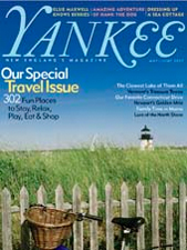
Yankee Magazine


I was driving down the main drag of Lafayette, CA, a well-to-do suburb just on the east side of the Caldicott Tunnel, and I noticed a new seafood restaurant named “Yankee Pier.” Being a seafood fan, that perked my interest but I was really drawn to the restaurant because of the signage, it really stuck in my head. Midway through the afternoon as I was sitting at my desk, it dawned on me why, the sign for said restaurant is a knockoff of the masthead of the tried and true New England staple, Yankee Magazine, which was founded in 1930. It is almost a requirement for every New England family to have a copy of the periodical in their bathroom. 

While it is not a just “stolen”, notice the difference in swashes with the Y and the K, there is no way the designer created this without knowing about the original. I looked at the biographies of the restaurant owners and none of them have a New England backgrounds, so I wonder if they have a knowledge of this.

I also wonder if the owners of of Yankee Pier, which is quite upscale, realize that someone gave them a second hand identity…

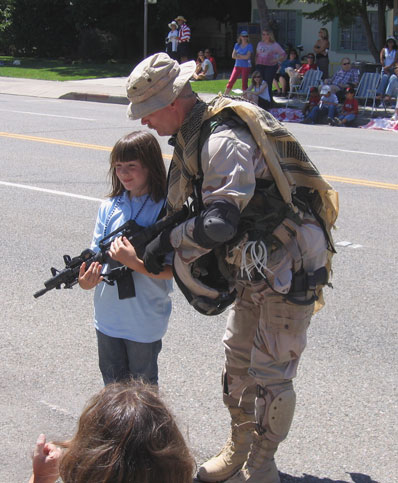
Kids Play?

And you wonder why the cycle of violence continues in this country.

I’m finally having the chance to see some movies again and thougtht I would share some thoughts…

Helvetica
On June 13th I managed to see a viewing of the documentary Helvetica, the ode to the ubiquitous font that is turning 50 years old this year. To say the least, it is a must-see for any graphic designer and a good time for anyone who just notices this informational world around them. The real stars of this film, surprisingly, is not the fonts but the type designers interviewed. They are alternately opinionated and hilarious with their opinions of Helvetica and tyopgraphy in general. Just think, the fonts you use when hacking away in Microsoft Office has so much history and says something about you…
You can go to helveticafilm.com to see if this film is coming your way. The director, who did a Q&A after the showing I attended, hinted that the film could be out on DVD in October.

Ratatouille
We went and saw the latest Pixar gem, Ratatouille, the other night. The visuals, especially the city of Paris, were amazing. While the plot did not contain the emotional intensities of Toy Story Finding Nemo and The Incredibles, the ode to Jerry Lewis-style visual comedy made it a fun time. The movie’s so good that I didn’t mind all the young kids in the theater making noise.

Brand Upon the Brain!
Quite possibly the most “artsy” movie attempt I have ever seen. Directed by Canadien Guy Maddin, it is an exploration of B&W silent film (though it is narrated by Isabella Rosellini), horror shows, Nancy Drew and lesbians. Sound inticing? It all sounds a bit too much to me though I appreciated the efforts and the vision. Coming soon to a theatre not near you for not very long…
As much as I have always said I would never do a blog, here I am now, a hypocrite. I am excited to do this as a blog about graphic design verses a rant about how life stinks though (I can’t stand those ones).
Here are my blog promises:
1. To only put up interesting thoughts and links on design
2. I will not rant about dogs eating my shoes or how sunny it is in California today
3. To only link and promote shows for Thunderbird Theatre Company if they are good.
4. No politics
5. No thoughts on Paris Hilton
6. To not talk smack about people
8. Not convince you to vote for an American Idol
9. To further educate the masses on good design and to eventually be responsible for someone understand kerning.
7. Not to convince you to join Amway

I will post a bit about myself as background info but that is for a later day as I have homework and the dogs are eating my shoes at the moment and Hollywood Extra has a story about Sanjaya on too…

Damn!

Dana